Guides / Web design
The most common mistakes on NZ small business websites
The most common mistake on New Zealand small business websites is not having one: plenty of businesses rely on a Facebook page or a Google Business Profile alone. Among businesses that do have a site, the problems repeat: no Google Business Profile, an unclear call to action, no useful content, walls of text, an inconsistent design, and weak branding. Here are the seven we see most often, why each one costs you work, and how to fix it.
- The biggest mistake is having no website at all, or no Google Business Profile
- On the site itself: an unclear call to action, no useful content, and walls of text
- Inconsistent design and weak branding make a good business easy to forget
Is having no website really a mistake?
Yes, and it is the most common one. Plenty of businesses rely on a Facebook page or a Google Business Profile alone. Joe Vu, a lawn and garden business we now work with in Sydney, was in exactly that position.
Both are worth having. Neither is a substitute. A Facebook page is rented space on someone else's platform, and a profile can only say so much. A customer who searches for a specific service in a specific place needs a page that answers that search, and a profile alone cannot give them one.
The fix: a small site with a page for each service. Our guide on whether you need a website covers when a profile alone is enough, and Joe's story is in our case study.
What do you miss without a Google Business Profile?
The map. Without a profile, a business misses out on Google Maps and the local results that appear above ordinary websites for searches like "plumber near me".
It is free, and Google says local results are based mainly on relevance, distance and prominence, all of which come from the profile and its reviews. A good website with no profile is half the job.
The fix: add or claim your profile and fill in every field. Our guide to getting your business on Google goes through it step by step.
Why does an unclear call to action cost you work?
Because a visitor who cannot tell what to do next does nothing. We see two versions of this. Either there is no obvious next step, or there are so many buttons competing that none stands out: Call, Email, Book, Quote, Learn more, Follow us, all the same size.
The fix: choose the one thing you most want a visitor to do, and make it the most obvious thing on every page. For most trades that is "Request a free quote" or "Book now".
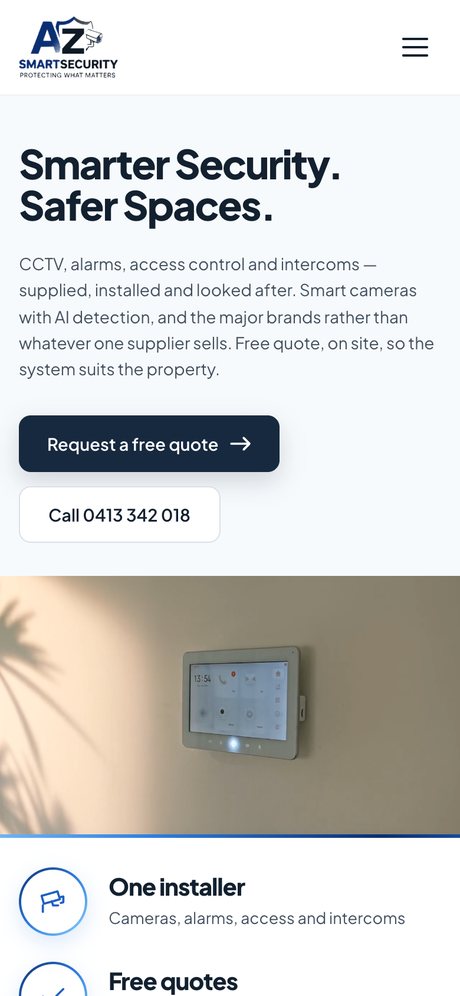
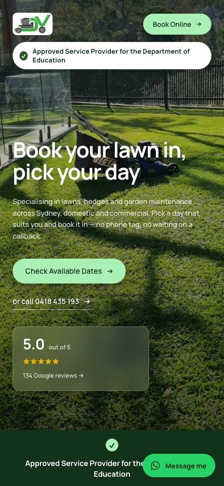
Why does a site need useful content?
Because without articles and pages that help visitors, there is little for Google, or for AI tools like ChatGPT, to find, trust and cite.
A five-page site that says "we offer quality service at competitive prices" could belong to anyone. Google's guidance on people-first content asks whether a page shows first-hand expertise, and its guide to generative AI search says unique, useful content matters more than any other suggestion it makes.
The fix: write down the questions customers ask you, and answer each one on the site in your own words. What does it cost? How long does it take? What should I do before you arrive? See our guide on being recommended by ChatGPT for why this now matters twice over.
What is wrong with a wall of text?
Nobody reads it. Too much writing and too few photos, graphics or visuals, and a visitor on a phone scrolls past all of it.
The fix: short paragraphs, clear headings, and a picture of the real thing wherever one helps. Real photos do not have to be perfect, but they do have to be tidy.
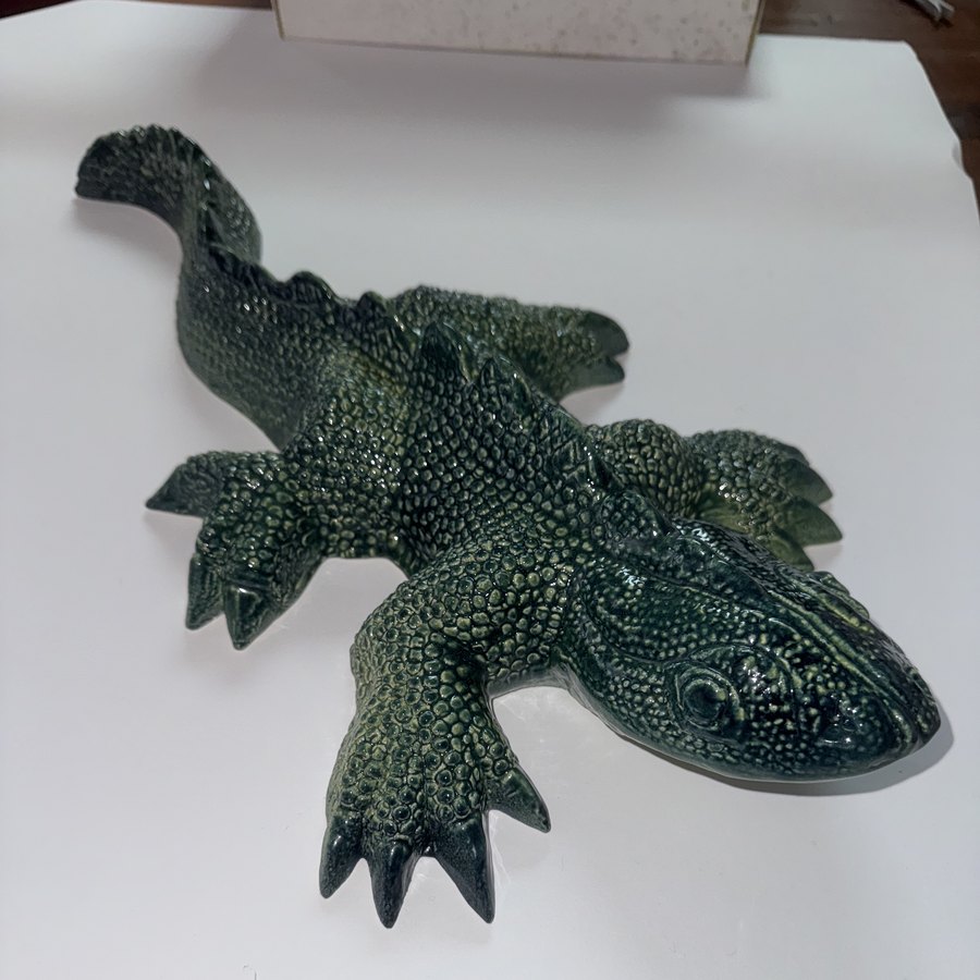
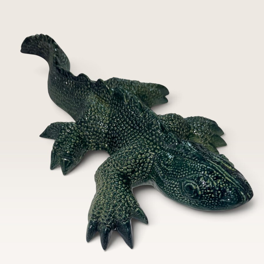
For a shop, we turn the owner's own photos into a uniform set for $5 a photo. See product photo editing.
Does it matter if the design is inconsistent?
It does. Mismatched colours, fonts and layouts from page to page make a business look as though several people built the site at different times, which is often what happened. Visitors may not name the problem, but they trust the site less.
The fix: one set of colours, one or two fonts, and one layout for each type of page, used everywhere.
What does weak branding look like?
A business that looks generic is easy to forget. The stock photo of a handshake, the template every other tradie in town is using, a logo typed in a default font.
The fix: you do not need an expensive brand exercise. You need your own photos, your own words, and a look that is recognisably yours and the same on the van, the invoice and the site.
How do you check your own site?
| Mistake | Quick test |
|---|---|
| No website | Search your trade and town. Is there a page of yours to click? |
| No Google profile | Search your business name. Does a panel appear with a map? |
| Unclear call to action | Show the home page to a friend for five seconds. Can they say what to do next? |
| No useful content | Does any page answer a question a customer has asked you this month? |
| Walls of text | On a phone, is there a screen with no heading and no picture? |
| Inconsistent design | Do the home page and the contact page look like the same business? |
| Weak branding | Cover the logo. Could it be a competitor's site? |
- One page per service, each naming where you work.
- One clear action on every page.
- Your own photos.
- Answers to real customer questions.
- The same colours, fonts and layout throughout.
- A complete Google Business Profile that matches the site.
If you are starting from nothing, see what pages a small business website needs.
Sources
- Google Business Profile Help: Add or claim your Business Profile
- Google Business Profile Help: Tips to improve your local ranking on Google
- Google Search Central: Creating helpful, reliable, people-first content
- Google Search Central: Optimizing your website for generative AI features
- Google Search Central: SEO Starter Guide